Using Visualizations to Better Communicate Scientific Findings
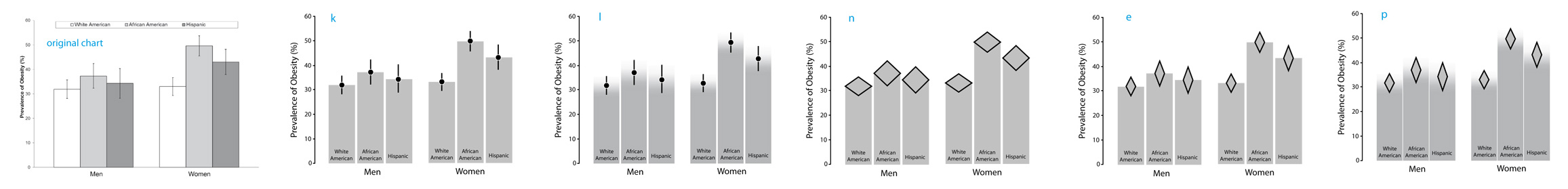
Examples of non-standard charts designed to convey both proportions and uncertainty.
Summary of the Internship Topic
Part of the scientific method is based on i) running experiments (e.g., have human subjects carry out tasks and measure their performance), ii) doing statistical analyses of the data collected and then iii) communicating the results of these analyses in a research article. Although lots of work has been done by statisticians in developing reliable and powerful statistical tools, often the statistics are miscommunicated and the findings misinterpreted.
This project will investigate how information visualization and human-computer interaction can help communicate the data behind scientific findings effectively. At least two types of approaches can be considered:
1) Using new interactive visualizations as a pedagogical tool, to help scientists build an accurate intuitive understanding of difficult statistical concepts (e.g., statistical significance, correlations, or confidence intervals) and of their conventional visual representations. One example would be to generate a fictitious scientific article where the data, analysis methods and presentation techniques can be interactively manipulated.
2) Improving existing visual representation techniques, e.g., by exploring and studying hybrid chart types that can faithfully and simultaneously convey several types of statistical information such as proportions (ratios between means), variances (how much the data is spread around means), and uncertainty (probability distribution of the means). No such unified and truthful statistical representation exists yet.
Part of this work will consist in designing interactive or static visualizations, testing them experimentally (either with scientists or through crowdsourcing), and disseminating them to scientists. Although the population of users targeted are initially scientists, the student can also consider studying techniques that are targeted to the general public (e.g., how to faithfully communicate scientific findings in a newspaper article, especially regarding effect sizes).
Requirements
The student should have a genuine interest in -- and if possible some basic knowledge of:
- Information visualization
- Human-Computer Interaction
- The scientific method and statistical data analysis
- Experimental psychology
A decent level of oral and written English and some programming skills are required. Speaking French is not required.
Advising
The student will be advised by Pierre Dragicevic. Possible informal collaboration with Geoff Cumming, emeritus professor at La Trobe University.
Links
- Wikipedia article on Exploratory Data Analysis.
- Bret Victor's website on Explorable Explanations.
- Geoff Cumming's video on The Dance of the p-values.
- Geoff Cumming's 20-min podcast interview on the Estimation Approach to Statistics.
- Example of previous research in Aviz on a related topic: Visualizations for Bayesian Reasoning, including a a pedagogical video explaning the base rate fallacy.
More advanced readings
- Beyth-Marom et al. (2008). Statistical Cognition: Towards Evidence-Based Practice in Statistics and Statistics Education.
- Micallef, Dragicevic and Fekete (2012). Assessing the Effect of Visualizations on Bayesian Reasoning through Crowdsourcing.
- Wilkinson and the Task Force on Statistical Inference (1999). Statistical Methods in Psychology Journals - Guidelines and Explanations.
- Cohen (1994). The Earth is Round (p < .05).
- Gigerenzer (2004). Mindless statistics.
- Cumming (2012). Understanding The New Statistics. (we have a copy of this book in Aviz)
- Coe (2009). It's the Effect Size, Stupid.
- Zacks and Tversky (1997). Bars and Lines: A Study of Graphic Communication.
- Newman and Scholl (2012). Bar graphs depicting averages are perceptually misinterpreted: The within-the-bar bias.
- Wickham and Stryjewski (2011). 40 Years of Box Plots.