Studying Early Decision Making with Progressive Bar Charts
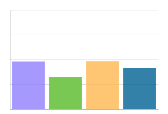
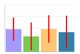
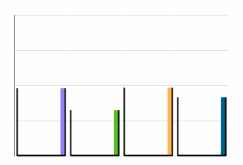
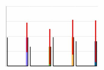
''Figure description: Four progressive bar chart designs showing the means for four columns of a data table loaded progressively, updated every second: (top left) baseline bar chart, (top right) bar chart with confidence intervals (95%), (bottom left) bar chart with near-history, and (bottom right) bar chart with near-history and confidence intervals. All the bar charts represent the same data at one step of the progression. For our proposed new designs (bottom), opacity and position along the X-axis encode the recency of the updates; opaque bars on the right represent more recent updates, and transparent bars on the left represent older updates.
Description
We conduct a user study to quantify and compare user performance for a value comparison task using four bar chart designs, where the bars show the mean values of data loaded progressively and updated every second (progressive bar charts). Progressive visualization divides different stages of the visualization pipeline—data loading, processing, and visualization—into iterative animated steps to limit the latency when loading large amounts of data. An animated visualization appearing quickly, unfolding, and getting more accurate with time, enables users to make early decisions. However, intermediate mean estimates are computed only on partial data and may not have time to converge to the true means, potentially misleading users and resulting in incorrect decisions. To address this issue, we propose two new designs visualizing the history of values in progressive bar charts, in addition to the use of confidence intervals. We comparatively study four progressive bar chart designs: with/without confidence intervals, and using near-history representation with/without confidence intervals, on three realistic data distributions. We evaluate user performance based on the percentage of correct answers (accuracy), response time, and user confidence. Our results show that, overall, users can make early and accurate decisions with 92% accuracy using only 18% of the data, regardless of the design. We find that our proposed bar chart design with only near-history is comparable to bar charts with only confidence intervals in performance, and the qualitative feedback we received indicates a preference for designs with history.
Paper
Ameya Patil, Gaëlle Richer, Christopher Jermaine, Dominik Moritz, Jean-Daniel Fekete IEEE Transactions on Visualization and Computer Graphics, 2023, 29 (1), pp.407-417. ⟨hal-03738461⟩ ⟨DOI:10.1109/TVCG.2022.3209426⟩
Presentation Video
Fast-Forward
Supplemental Material Video Video
Pre-Recorded Talk
Live Presentation at IEEE VIS 2022
Data
- All data (with ccby license) from the paper are available on https://osf.io/tn2ph