Comparisson with UpSet
There are visualization techniques that look identical and show very different data, for example bar charts and histograms, or scatter plots and multidimensional projections. In the same way, PAOHVis and UpSet may look similar, but are semantically different, as we will see in the following example.
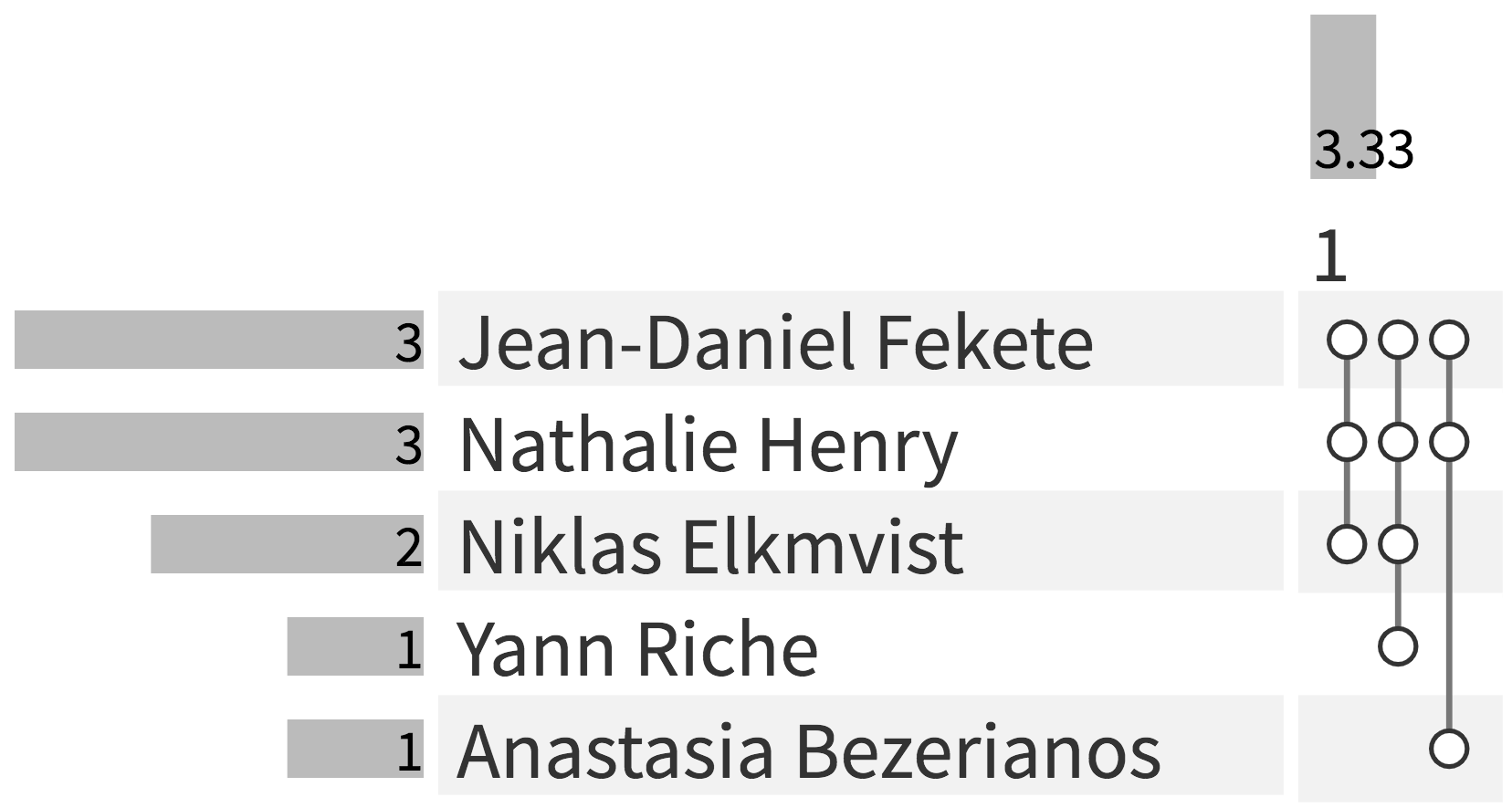
The following figure shows three papers published by five co-authors visualized by PAOH. Loading and trying to visualize all sets of a small dataset with thirteen vertices and twenty-seven hyperedges—Figure 2 of our paper—crashed UpSet because it tries to create too many intersections (tested in April of 2019).
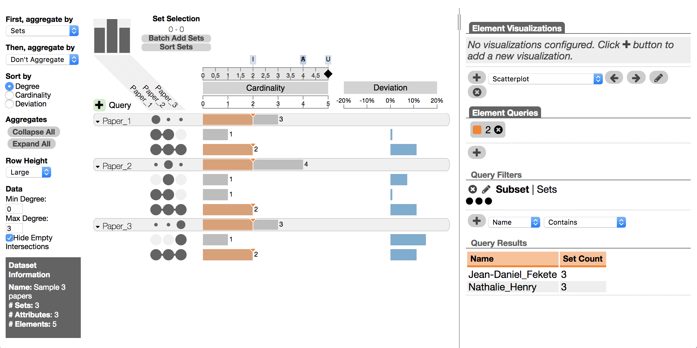
The following figure shows the three papers, turned into sets of authors, visualized by UpSet and aggregated by Sets. The author names (set members) of each paper are not shown by default. Names appear at the bottom right only when selecting a set intersection (e.g., the intersection of the 3 papers shows 2 names).
And in the next figure, we show the same dataset aggregated by Degree.
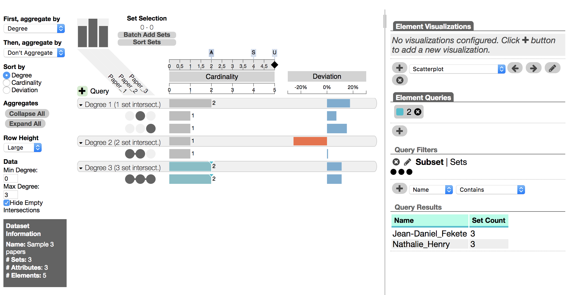
Clearly, UpSet visualizes very different information than PAOH—the intersections of author sets vs. the authors—and is not intended to visualize hypergraphs, even less dynamic hypergraphs.