A Real-Time application
ParcoursVis is categorized as a "Progressive" visual analytic system. While it is extracting the high-level events from the database, it shows to users partial results and remain reactive, while the visualization will be more and more accurate as the data is parsed.

A loading animation associated to a yellow counting (see screenshot) in the banner gives to users how many patients have been processed so far. The loading animation and the yellow background of the counter disappear once the application has parsed all the data.
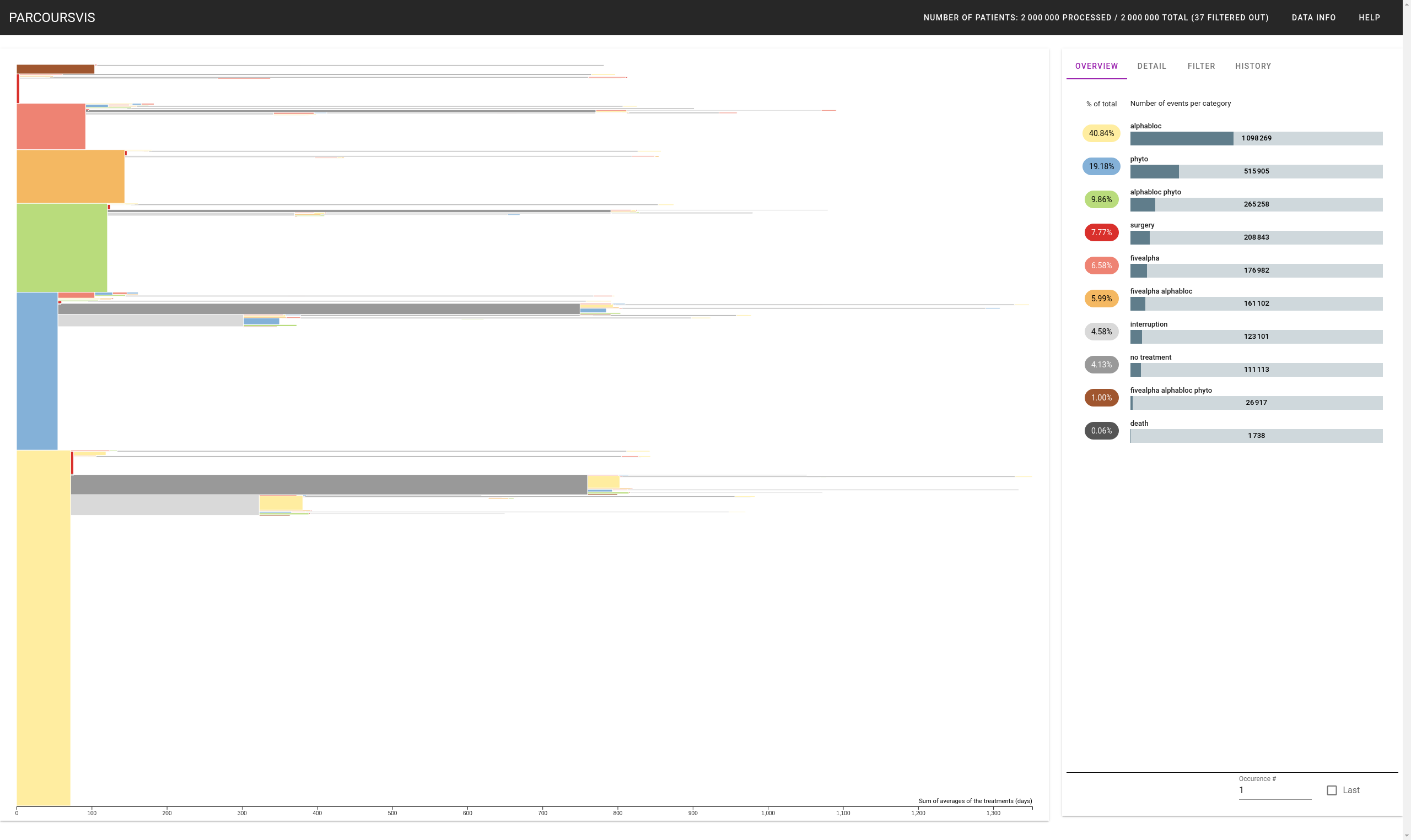
The Main View
The main view of parcoursvis displays a tree of events. We read the tree from left to right. For instance, in the screenshot above, the selected event is part of the sequence (from older to newer) [phyto; no treatment; alphabloc].
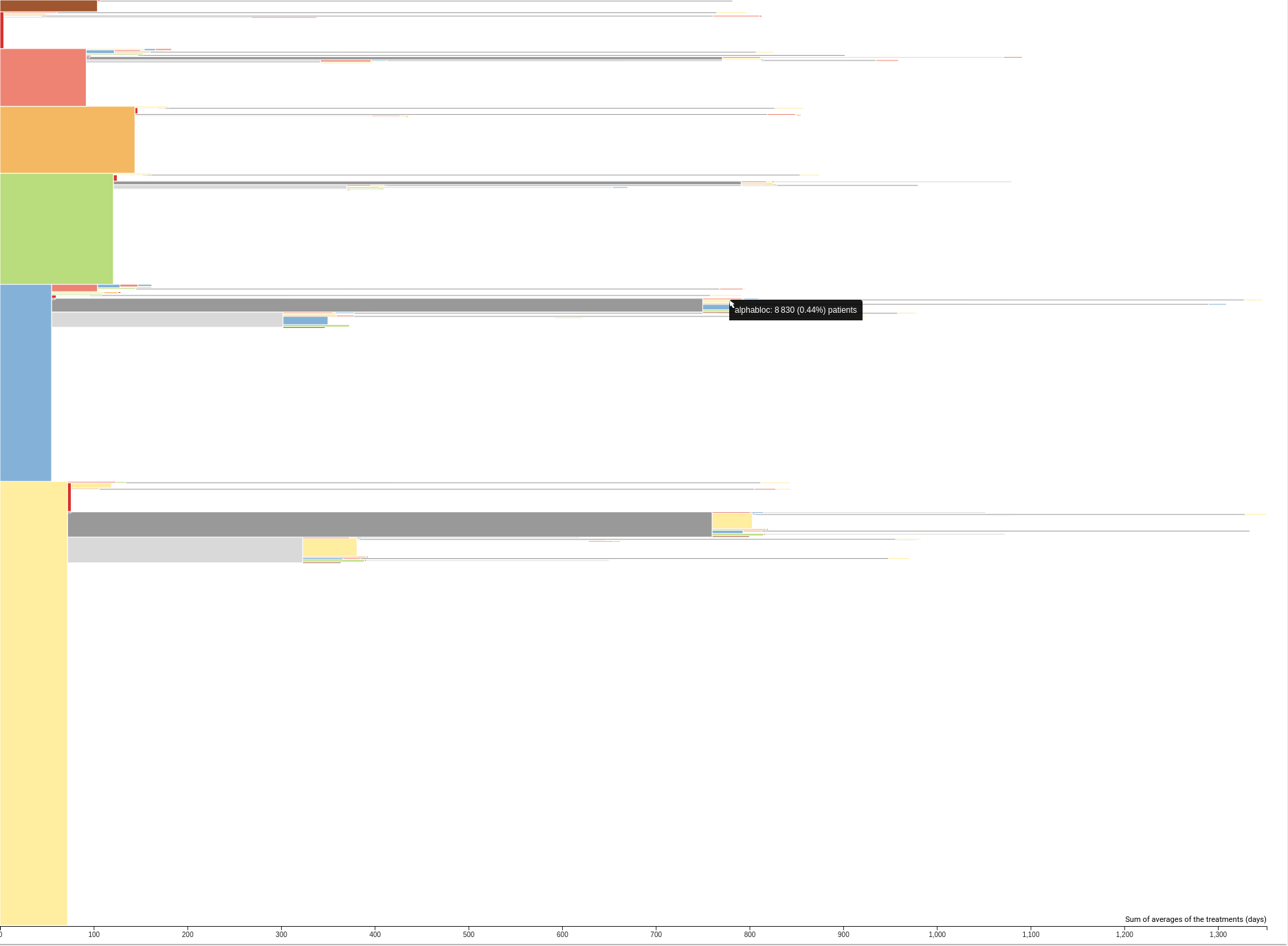
Hoverring over a node gives its type of high-level event, and the number of patients that have a pathway corresponding to this sequence of event. It is not because no more nodes are rendered after a sequence that they do not exist. The visualization may have been truncated to a certain "depth" (maximum sequence length displayed), and it may have discarded events with nbPatients < threshold for better readability.
The "width" of events represent the average days of each patient that have this sequence so far. For instance, on average, patients took for first treatment "alphabloc" for approximately 80 days. More details about a node are accessible upon a click; see the Detail Panel.
Sidebar
The Sidebar on the right gives additional data and control to the user. It is composed of several panels that we describe below.
Overview Panel
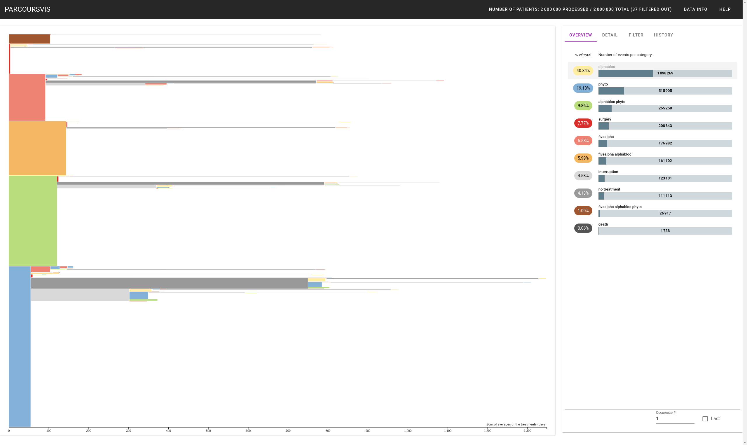
The Overview Panel shows how many high-level events are part of the node the user has zoomed in (see BasicFeatures#Zoom?). It allows user also to relate the color of the blocs displayed in the Main View, and their labels. For the MainView, clicking on a type will remove all the sequences where this type is the first event. For instance, in the previous screenshot, all the sequences that start with "Alphabloc" are removed from the visualization.
Detail Panel
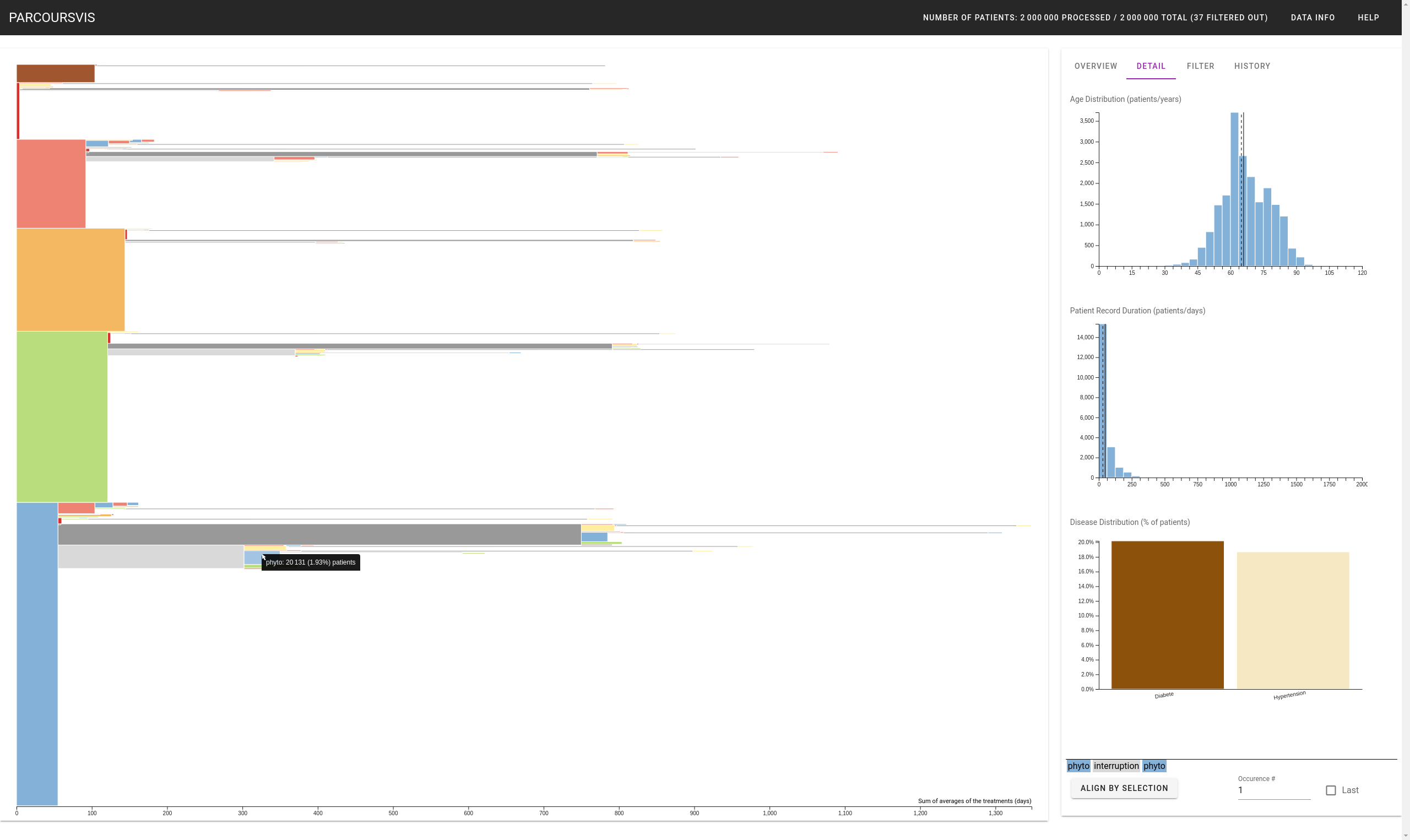
The Detail Panel gives specific information about a node. When the user clicks on a node, the tab "Detail" is automatically shown. It shows:
- The distribution of ages of the patients that have this event as part of the selected sequence.
- The distribution of the duration of all the events that are part of this sequence.
- The distribution of the co-morbidities of all the patients that have this event as part of the selected sequence.
For instance, the following screenshot shows the distribution of ages, duration, and co-morbidities of all the 20,131 patients that followed the following (but maybe uncomplete) care pathways (from older to newer) [phyto; no treatment; phyto]. Moreover, selecting a node displays the sequence of this node in the bottom right corner of the Sidebar.
Hovering the dash and plain lines in the distributions will show the exact average (plain line) and approximate median (dashed line; which bar in the histogram) of the distributions.
Filter Panel
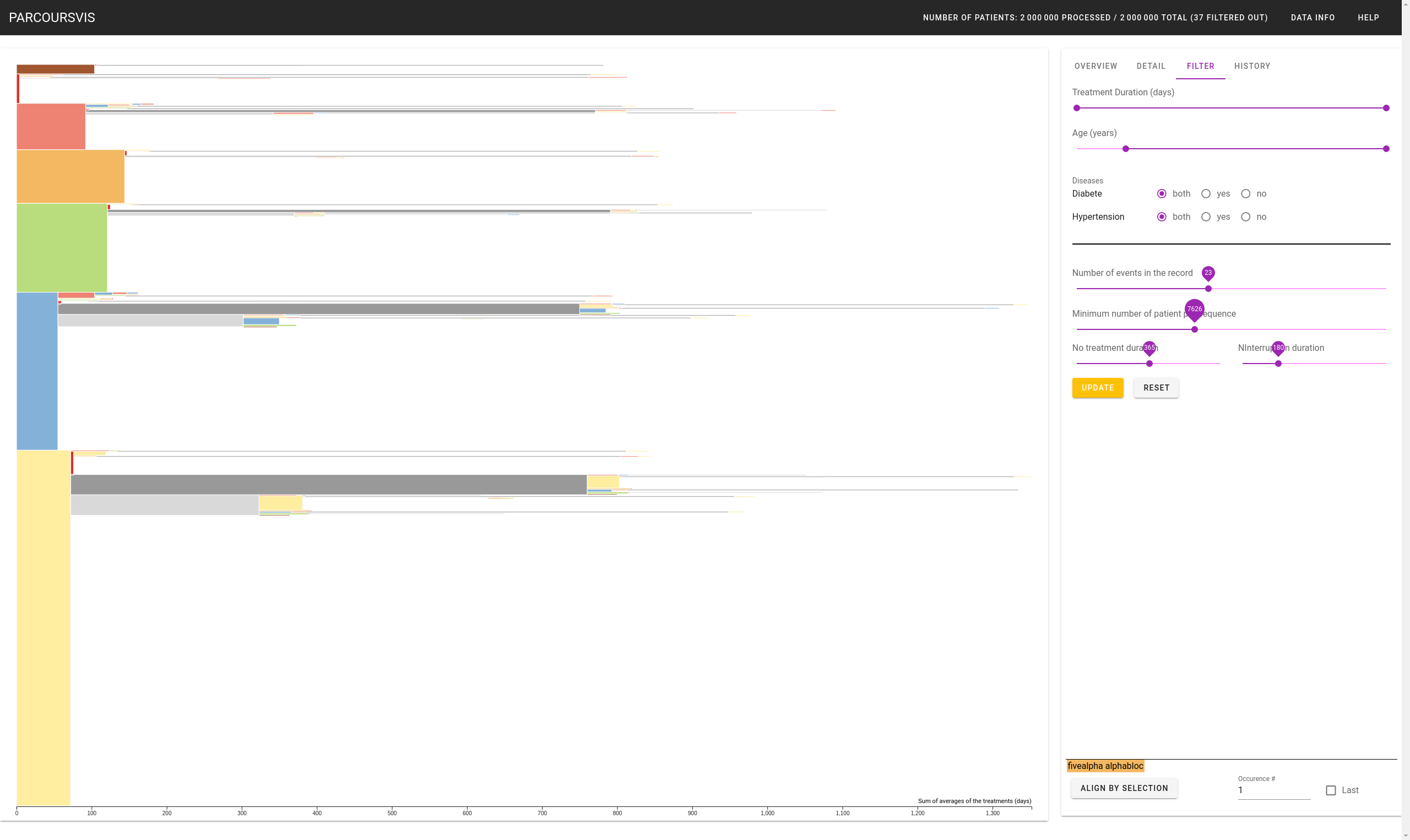
The Filter Panel allows the user to filter either the dataset itself (i.e., attributes related to the patients), or the visualization (i.e., what is the truncated length of a sequence). The visualization does not update when the user manipulates the widgets or the reset button (which will put all the widgets to their default values). The user must press the "yellowish" Update button to apply the filter.
Each time the user update the filter, the application relaunch the progressive algorithm.
History Panel
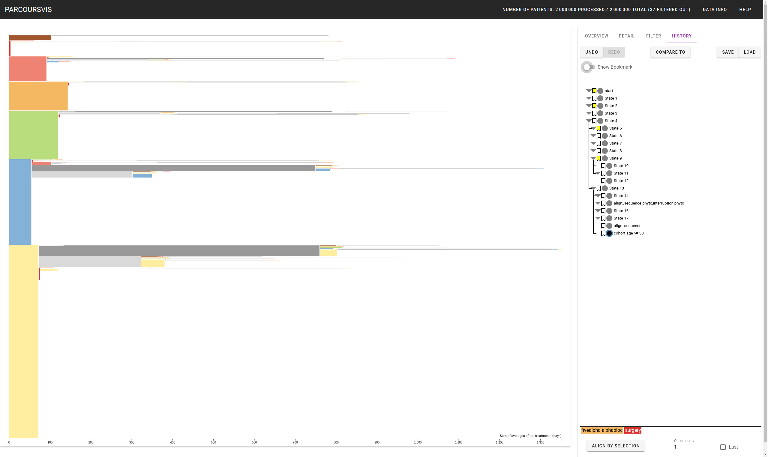
The History Panel shows all the users' records in a tree format. Users can go back to a previous state by clicking on the corresponding node. The node corresponding to the current state is highlighted in black with a blue halo. Clicking on the label, or right clicking on the node, allow users to rename that state to a more suitable name, e.g., cohort age >= 30 (see also the previous screenshot).
Users can Undo/Redo their actions using Ctrl+Z (Undo) and Ctrl+Y (Redo), or by clicking on the corresponding buttons in the History Panel. Users can also export the history and later reload it to keep trace of previous sessions. The files are stored in a JSON format.
Going back in the history and continuing the exploration will create a new branch of events. Users can fold, just like for a file browser, node of events to hide their following events.
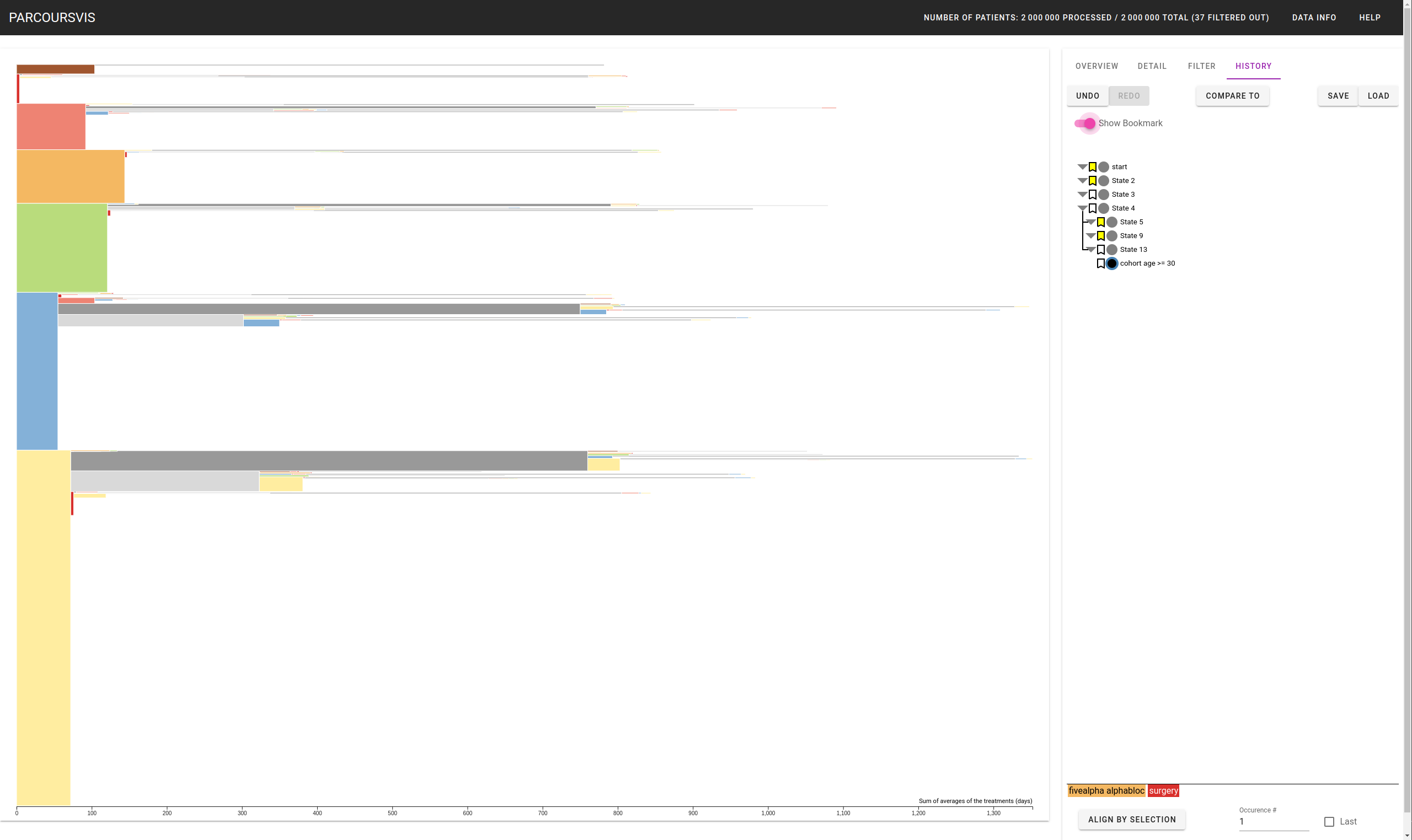
Users can also bookmark some nodes for later analysis. The "Show Bookmark" toggle button, once enabled, shows only flagged nodes (with the bookmark icon in yellow) and all the nodes between the current state and its "first parent" that is bookmarked. For instance, the node "cohort age >= 30" (see screenshot) has for parents (from more recent to older): "State 13", "State 4", "State 3", "State 2", "State 1", and "start" with "State 2" and "Start" being bookmarked. "State 2" being the "more recent parent being bookmarked", all nodes between "State 2" and "cohort age >= 30" are shown. We made this choice to let user aware of where he/she is in the hierarchy.
Finally, users can start to compare the current state with a previous state by clicking on the Compared to button?.