Deconstructing a Visualization
Learning Goal
Train yourself in decoding charts so that you can better understand how virtually every single visualization can be described using the language and rules of visual encoding and decomposed into low-level graphical components.
How do you know if you are on the right track? You can describe a chart in terms of its graphical components
Instructions
For each of the following charts identify:
- Data items and marks used to encode them.
- Data attributes and channels used to encode them.
Use this template for your answer for each chart:
- Data items represent: ...
- Mark used for data items: ...
- Data attributes: …
- Visual channels: …
- For each attribute:
- Attribute 1 is encoded with …
- Attribute 2 is encoded with …
- …
- Attribute n is encoded with …
NOTE: at the bottom of each chart there is a link to a web page providing details about the project (including information about the data).
HELP:If you are still unsure about what I told you in the lecture and you'd like to get it explained to you by another person (sometimes this helps!), have a look at Tamara Munzner explaining what is relevant to this assignment here: https://youtu.be/IKSRwGZe8Oc?t=1065
Chart 1
Note: Right-click the image and then "view image" to see the image at full resolution
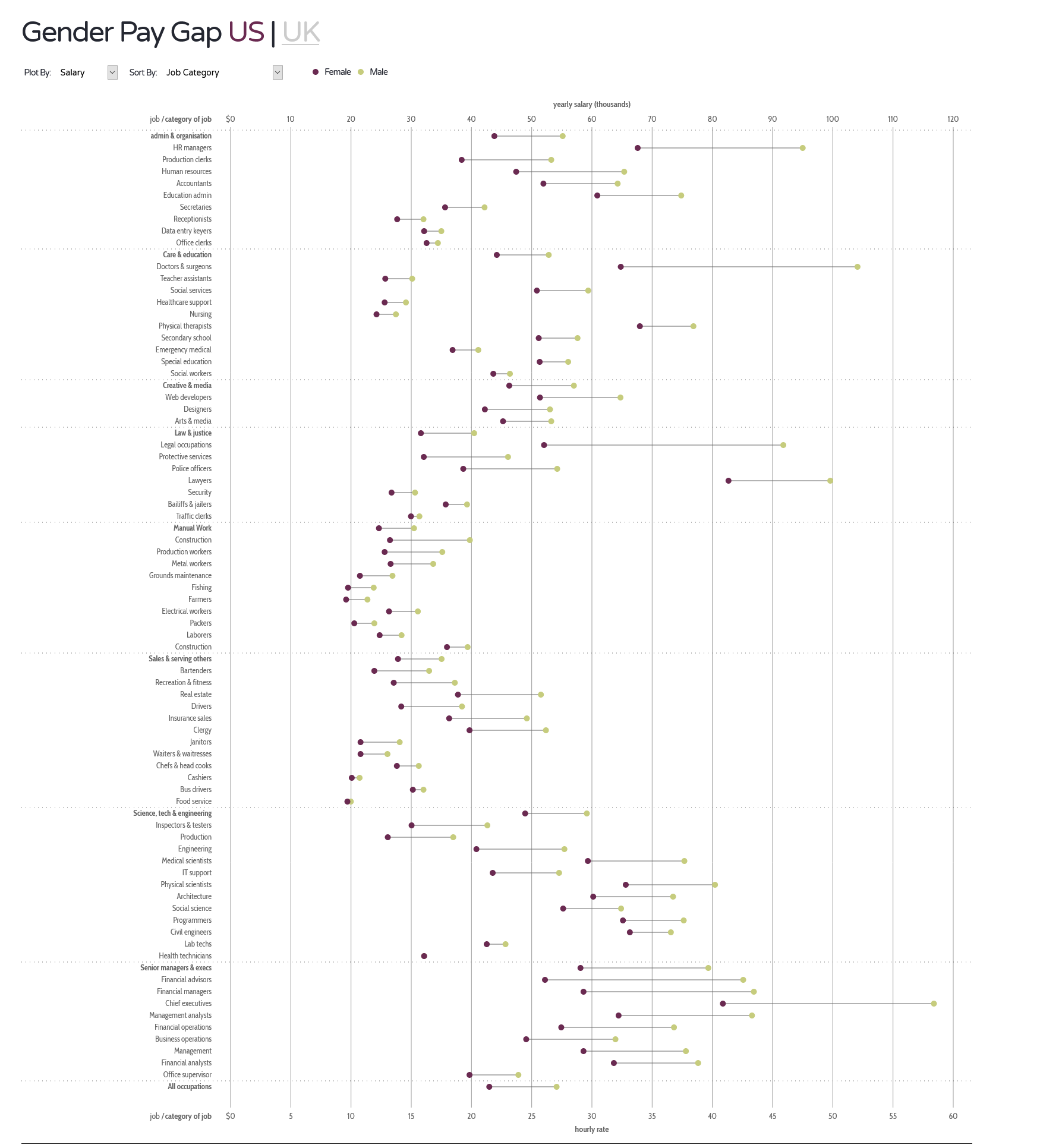
https://informationisbeautiful.net/visualizations/gender-pay-gap/
Chart 2
Note: Right-click the image and then "view image" to see the image at full resolution

https://flowingdata.com/2020/07/07/foreign-students/
Chart 3
Note: Right-click the image and then "view image" to see the image at full resolution. The image with multiple small networks is the one you are to analyze for the assignment. I copy a second image with detail information below that you might need to correctly interpret the top image. Also read the accompanying website.
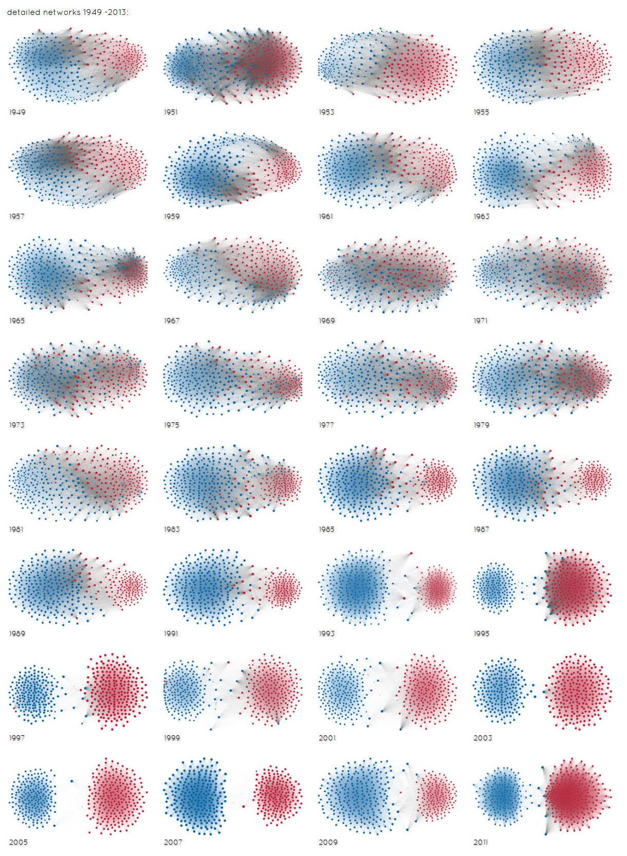
The image below is a detailed view of one of the small graphs above. The assignment is about the big graph above but you need to look at the detail on the image below to be able to read the visualization above.
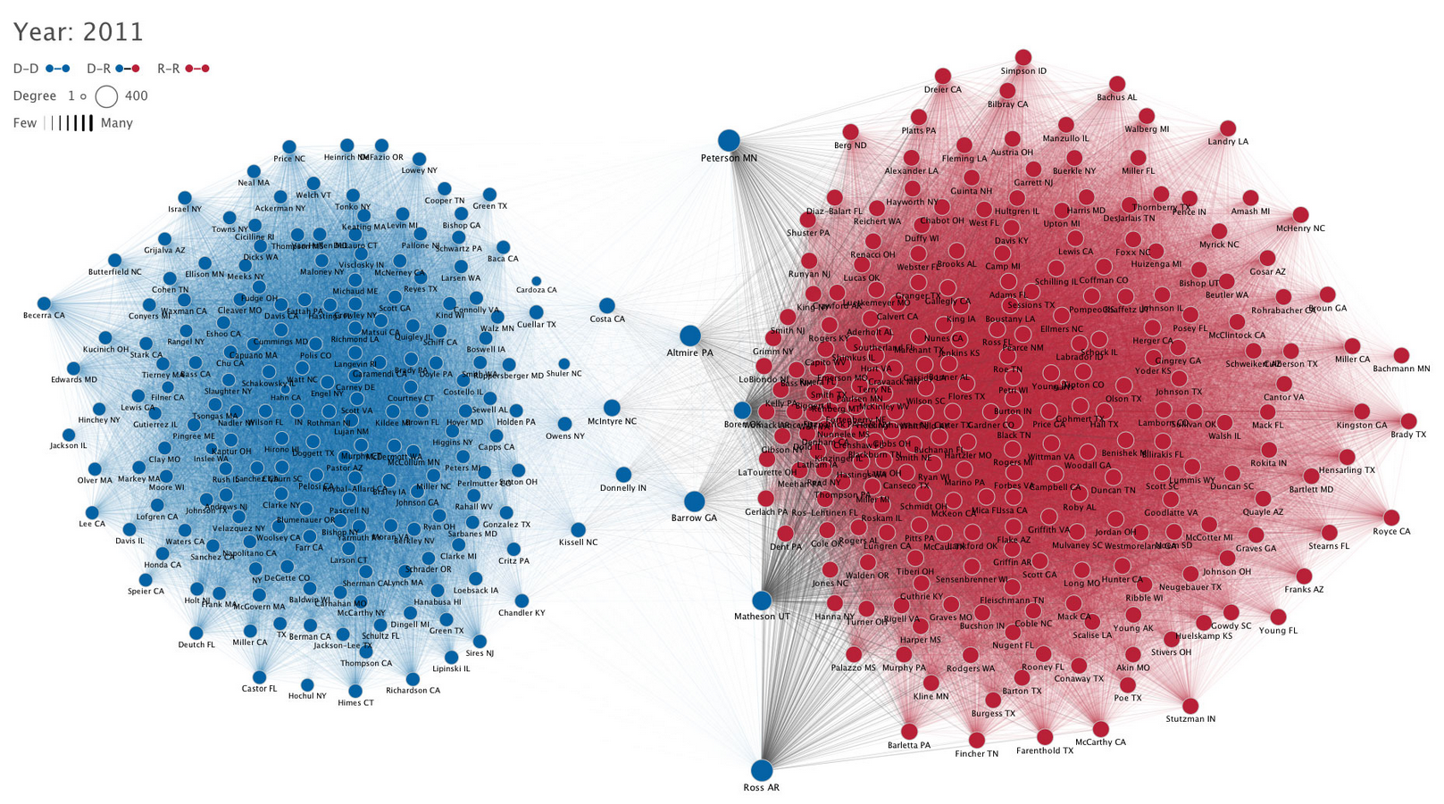
http://www.mamartino.com/projects/rise_of_partisanship/
Submitting the Assignment
WHAT - To complete the assignment you should:
- Create a pdf in the format outlined at the top of the page. Describe the charts in the order given here. Use the correct language discussed in class. Look at the lecture slides to remind yourself of the correct terminology.
WHERE - Name your pdf as LASTNAME-Assignment1.pdf. Attach your pdf to an email and send it to petra.isenberg@inria.fr with the subject VA-Assignment-1.
WHEN - Assignment 1 is due before 23:00 on Sep 30th
Acknowledgement
This assignment was inspired by a similar one for the Data Visualization course held by my colleague Enrico Bertini at New York University